SaaS content marketing
BOFU Content for SaaS: The Comparison and Alternative Pages That Close Deals
Zadhid Powell · 6 min read

On this page
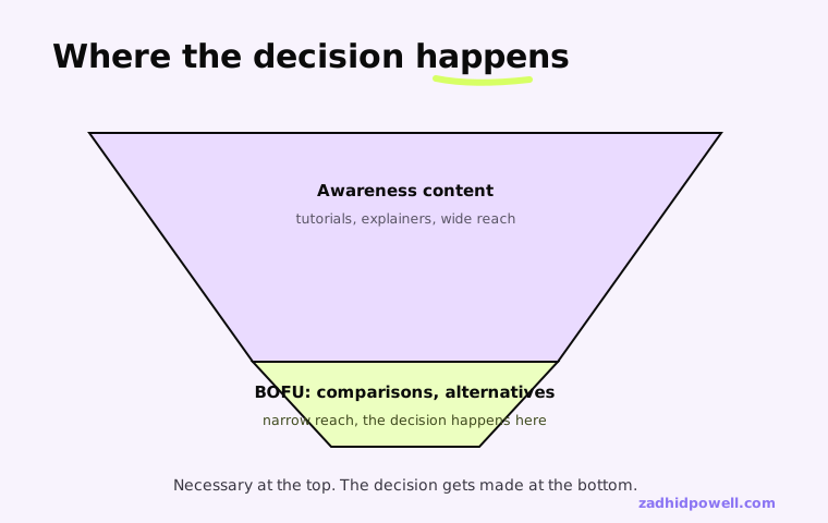
Most SaaS content optimizes for the top of the funnel: awareness, explainer posts, tutorials. That's necessary, but it isn't where the buying decision happens.
The decision happens on a narrower set of pages: comparisons, alternatives, and the handful of posts a buyer reads right before they pick up the phone or start a trial.
I spent years writing exactly this kind of content at Geekflare, reviewing more than 70 different APIs and tools for a readership that ranged from engineers evaluating integration depth to founders comparing vendors.
That volume taught me what actually makes a comparison page work, and it isn't the thing most SaaS marketing teams assume.
This piece is the bottom-of-funnel half of the SaaS content system: the pages that do the closing, not just the attracting.
Why BOFU Content Is Different From Everything Else You Publish
A tutorial earns trust by being useful. A comparison page earns trust by being honest, and those are not the same skill.
A reader hitting a tutorial has a problem and a search bar. A reader hitting a comparison page already knows the category and is actively deciding between two or three specific options, often with a credit card nearby.
That reader has already read your competitor's version of the same page. They know what a rigged comparison looks like, because they've seen a handful of them today.
Content Marketing Institute's 2025 B2B research found 58 percent of B2B marketers rate their own content strategy as only moderately effective. Most of that gap sits right here, at the pages that are supposed to close, not just attract.
What 70+ Reviews at Geekflare Taught Me About Comparisons
Doing that on every single review, not the occasional one, forces a specific discipline: you can't fake understanding a product you're reviewing for the seventieth time.
Marketing copy describes what a product claims to do. A real review has to test that claim against what the product actually does, then say so plainly when the two don't match.
The reviews that performed best weren't the most flattering ones. They were the ones that named a real limitation next to a real strength, because that's the only kind of review a skeptical buyer actually believes.
That's the exact instinct most SaaS comparison pages are missing. They're written to make the company's own product win, which is precisely what a buyer has learned to discount on sight.
Pro tip: Write the section about your own weakest point first. If you can't state it honestly in one sentence, the rest of the page will read as marketing no matter how balanced the introduction sounds.
The Anatomy of a Comparison Page That Closes
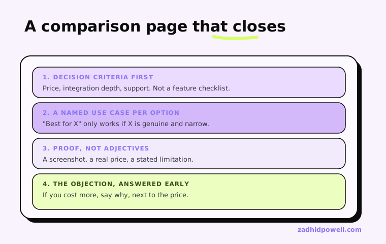
A comparison page that converts answers one question fast: which of these is right for me, specifically, not which one is objectively best.
- Lead with the decision criteria a real buyer uses, not a feature checklist. Price, integration depth, and support responsiveness usually matter more than a longer feature list.
- Name a real use case each option wins at. "Best for X" only works if X is a genuine, narrow scenario, not a vague superlative.
- Show, don't just claim. A screenshot, a real pricing tier, or a specific limitation does more work than an adjective.
- Answer the objection before the reader has to ask it. If your product costs more, say why, in the same breath as the price.
Why Honesty Converts Better Than a Hit Piece
A hit piece against a competitor reads exactly like what it is, and a technical or experienced buyer disengages the moment they spot it.
The stronger move is naming where a competitor is genuinely a better fit for some buyer, somewhere. It costs a fraction of readers who were never going to buy anyway, and earns the trust of every reader who was actually deciding.
Gartner's research on the B2B buying journey found buyers now complete roughly 80 percent of their purchase process alone, before ever reaching a salesperson. An honest comparison page is often the closest thing to a sales conversation that stretch of the journey gets.
G2's 2025 Buyer Behavior Report found two-thirds of B2B buyers now prefer to research on their own before ever talking to a salesperson. Your comparison page is doing the job a rep used to do, for a buyer who'd rather not talk to one yet.
Common Mistakes That Turn a Comparison Page Into an Ad
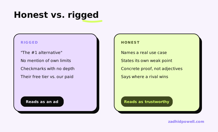
- Comparing your paid tier against a competitor's free tier, or vice versa, without saying so.
- A features table with checkmarks that don't reflect real functional depth.
- No mention of your own product's limitations anywhere on the page.
- Burying the actual comparison under three paragraphs of category explainer before getting to the point.
Every one of these is a shortcut that reads as a shortcut. A buyer doing real diligence catches every one, and catching a single one is usually enough to sink the credibility of the whole page.
That same accuracy discipline is what earns trust with a technical reader too, on a comparison page or anywhere else. I've written separately about the review gate that catches an inaccurate claim before it ships.
None of this works without traffic reaching the page in the first place. That's the compounding half of this system, and the two only work together.
A comparison page can also rank well and still fail to convert, if it's built for the wrong buyer stage. Here's that specific failure mode.
Once comparison pages are live, the only way to know if they're actually closing deals is tracking them properly. Here's how, and the strategy they fit inside.
Frequently asked questions
What is BOFU content in SaaS marketing?
BOFU, bottom-of-funnel, content is the small set of pages, mainly comparisons, alternatives, and case studies, that a buyer reads right before deciding.
Unlike top-of-funnel content, it's written for someone who already knows the category and is actively choosing between specific, named options.
What makes a SaaS comparison page actually convert?
Honesty about where a competitor wins, real decision criteria instead of a feature checklist, and specific proof over adjectives.
A comparison page that never mentions its own product's limitations reads as marketing, and skeptical buyers discount it on sight.
Should a comparison page ever say a competitor is better?
Yes, for a specific, narrow use case. Naming where a competitor genuinely wins costs a few readers who were never buying anyway, and earns the trust of the readers who are actually deciding.
How is a comparison page different from a product review?
A review, done honestly, is closer to journalism: testing a product's claims against what it actually does. A comparison page applies that same discipline but structures it around one specific buying decision between two or three named options.
Written by
Zadhid Powell
SaaS content strategist and technical writer. I help software companies turn product knowledge into content that ranks, gets cited by AI, and supports pipeline.
Keep reading
Working on this kind of problem?
If this is relevant to what you are building, let's talk about it.
Get in touch